Myths about teaching can hold you back
Learn why
These resources will be removed by the end of the Spring Term 2026.
Start using our brand new teaching resources now. Designed by teachers and subject experts, with real classrooms in mind.
The older resources below were created for lockdown learning during the pandemic and are not designed for classroom teaching.
Lesson details
Key learning points
- In this lesson, we will create charts using our previously compiled databases. Then we will compare different ways of viewing information.
Licence
This content is made available by Oak National Academy Limited and its partners and licensed under Oak’s terms & conditions (Collection 1), except where otherwise stated.
Loading...
3 Questions
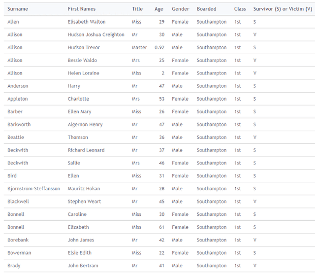
Q1.Which search term would return these results?
Which search term would return these results?

Age = 37
Class = 2nd
Gender = Male
Q2.What would you search for to answer this question – ‘How many males under ten years old were on board the Titanic?
What would you search for to answer this question – ‘How many males under ten years old were on board the Titanic?
Gender AND Class
Gender OR Age
Name AND Age
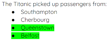
Q3.What would you search for to answer this question – ‘Altogether, how many people boarded at the highlighted places?’
What would you search for to answer this question – ‘Altogether, how many people boarded at the highlighted places?’

Age = 10 and Boarded = Belfast
Boarded = Queenstown and Boarded = Belfast
Boarded = Queenstown or Age = 10
3 Questions
Q1.Creating a chart on a computer is better than creating by a chart by drawing because ... (Tick 2 boxes)
Creating a chart on a computer is better than creating by a chart by drawing because ... (Tick 2 boxes)
It will always be right
It will be more accurate
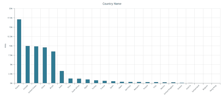
Q2.Which two fields have been used to create this graph?
Which two fields have been used to create this graph?

Area and currency
Currency and population
Population and country name
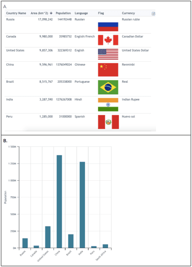
Q3.Here are two views which we can see when using a database: ‘table view’ and ‘chart view’. If I wanted to know which two of the countries listed had the largest population, which view would be the most useful?
Here are two views which we can see when using a database: ‘table view’ and ‘chart view’. If I wanted to know which two of the countries listed had the largest population, which view would be the most useful?

Table view