Year 6
These resources will be removed by end of Summer Term 2025.
Switch to our new teaching resources now - designed by teachers and leading subject experts, and tested in classrooms.
These resources were created for remote use during the pandemic and are not designed for classroom teaching.
Lesson details
Key learning points
- In this lesson, we will acquire the skills to create charts in Google Sheets. We will evaluate results based on questions asked using the chart that we have created. Finally, we will appreciate there are different software tools available within spreadsheet applications to present data.
Licence
This content is made available by Oak National Academy Limited and its partners and licensed under Oak’s terms & conditions (Collection 1), except where otherwise stated.
3 Questions
Q1.
Why are data headings important? (Tick 2 boxes)
They allow us to experiment with formatting.
They look attractive on a spreadsheet.
Q2.
Why should data be organised? (Tick 2 boxes)
It stifles creativity.
Makes the spreadsheet attractive.
Q3.
What calculation in your formula will you use to find C2-Total budget?

A2-B2
A2/B2
A2+B2
4 Questions
Q1.
Presenting data using tables are helpful when you want to: (Tick 2 correct choices)
Compare the data
See the data visually
Q2.
Presenting data using graphs and charts are helpful when you want to: (Tick 2 correct choices)
Make changes to the data (adding / taking away items, etc.)
View the individual figures
Q3.
Which is the best way to present data? Tables OR graphs and charts?
Graphs and charts
Tables
Q4.
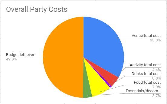
Look at the pie-chart to answer this question. Which spending type did you spend the most money on?

Activity total cost
Drinks total cost
Food total cost

