Myths about teaching can hold you back
Learn why
These resources will be removed by the end of the Spring Term 2026.
Start using our brand new teaching resources now. Designed by teachers and subject experts, with real classrooms in mind.
The older resources below were created for lockdown learning during the pandemic and are not designed for classroom teaching.
Lesson details
Key learning points
- In this lesson, we will learn about the investigative cycle PPDAC (problem, plan, data, analyse, conclusion) and apply part of this cycle to a data set about roller coasters.
Licence
This content is made available by Oak National Academy Limited and its partners and licensed under Oak’s terms & conditions (Collection 1), except where otherwise stated.
Loading...
3 Questions
Q1.In relation to data science, advances in technology has made it more feasible to do what?
In relation to data science, advances in technology has made it more feasible to do what?
Data to be analysed at a local level, it is still not possible to analyse data sets that collect global data
Store large volumes of data but data collection still needs to be done manually
Q2.What data might a video streaming service collect?
What data might a video streaming service collect?
Most popular actors
Most popular genres
Most popular tv shows
Users' favourite actors/directors based on their viewing habits
Users' favourite genre based on their viewing habits
Q3.Which two of the following might be reasons why a video streaming service collect this data?
Which two of the following might be reasons why a video streaming service collect this data?
To store and pass on to other companies without your permission
3 Questions
Q1.What is meant by a correlation?
What is meant by a correlation?
When data is placed in a graph
When there is a set of data that doesn’t lie in the normal or expected range
When there is an upward trend in a graph
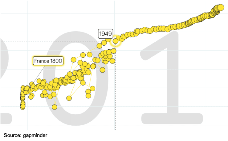
Q2.The visualisation below plots life expectancy (y-axis) against time (x-axis). What type of correlation does this visualisation show from 1949 onwards?
The visualisation below plots life expectancy (y-axis) against time (x-axis). What type of correlation does this visualisation show from 1949 onwards?

Negative
Neutral
No correlation is visible
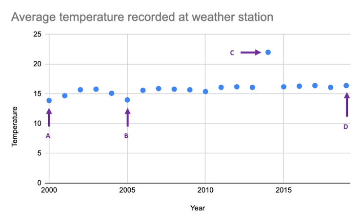
Q3.The following graph shows the annual average temperatures recorded by a weather station over a period of 20 years. Identify the outlier in the data.
The following graph shows the annual average temperatures recorded by a weather station over a period of 20 years. Identify the outlier in the data.

Point A
Point B
Point D