Myths about teaching can hold you back

Lesson details
Key learning points
- Knowing the angle size for a sector allows calculation of the frequency.
- By knowing the total, statements can be made comparing the data.
- Different pie charts may have different totals even though proportions are the same.
Keywords
Pie chart - A pie chart (pie graph) is a circular graph where sectors represent different groups proportionally.
Frequency - The frequency is the number of times an event occurs; or the number of individuals (people, animals etc.) with some specific property.
Sector - A sector is the region formed between two radii and their connecting arc.
Proportion - Proportion is a part to whole (sometimes part to part) comparison. If two things are proportional, the ratio of part to whole is maintained
Degrees - Degrees are the most common unit of measurement for angle. One whole turn is equal to 360 degrees, written 360°.
Common misconception
Two sectors on two different pie charts that have the same angle represent the same frequency.
90° of a pie chart of 4 data points represents less frequency (frequency of 1) than 90° of a pie chart of 200 data points (frequency of 50).
To help you plan your year 8 maths lesson on: Interpreting pie charts, download all teaching resources for free and adapt to suit your pupils' needs...
To help you plan your year 8 maths lesson on: Interpreting pie charts, download all teaching resources for free and adapt to suit your pupils' needs.
The starter quiz will activate and check your pupils' prior knowledge, with versions available both with and without answers in PDF format.
We use learning cycles to break down learning into key concepts or ideas linked to the learning outcome. Each learning cycle features explanations with checks for understanding and practice tasks with feedback. All of this is found in our slide decks, ready for you to download and edit. The practice tasks are also available as printable worksheets and some lessons have additional materials with extra material you might need for teaching the lesson.
The assessment exit quiz will test your pupils' understanding of the key learning points.
Our video is a tool for planning, showing how other teachers might teach the lesson, offering helpful tips, modelled explanations and inspiration for your own delivery in the classroom. Plus, you can set it as homework or revision for pupils and keep their learning on track by sharing an online pupil version of this lesson.
Explore more key stage 3 maths lessons from the Graphical representations of data unit, dive into the full secondary maths curriculum, or learn more about lesson planning.

Licence
Lesson video
Loading...
Prior knowledge starter quiz
6 Questions
Q1.120 people were asked: "what do you most frequently drink whilst at work". The results will be placed in a pie chart with a total of 20 pre-defined sectors. How many sectors would represent water?
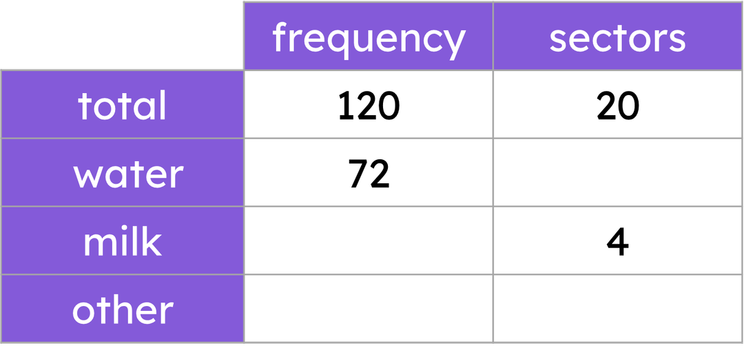
Q2.120 people were asked: "what do you most frequently drink whilst at work". The results will be placed in a pie chart with a total of 20 pre-defined sectors. How many people voted for milk?
Q3.A large set of information is collected and represented in a pie chart of 30 equally-sized sectors. Each sector represents a frequency of 40. What is the total frequency of this dataset?
Q4.Which of these words is not an essential feature of a pie chart or the calculations required to construct a pie chart?
Q5.The incomplete ratio table shows a dataset being converted into angles to represent each subgroup as sectors on a pie chart. Match the letters to the correct missing values.
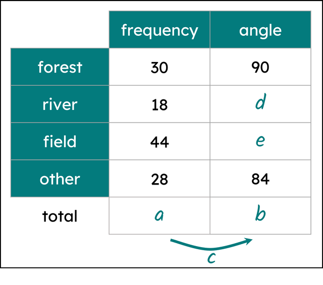
a -
120
b -
360
c -
3
d -
54
e -
132
Q6.The incomplete ratio table shows a dataset being converted into angles to represent each subgroup as sectors on a pie chart. Find the value of angle a, in degrees.
Assessment exit quiz
6 Questions
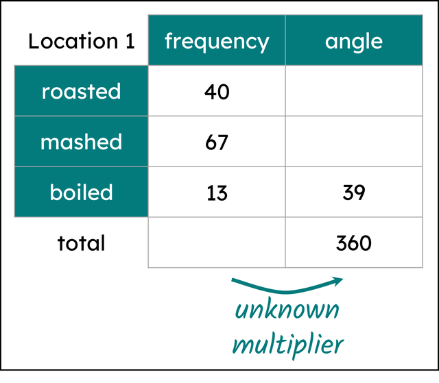
Q1.The table shows the number of people at Location 1 and their preferred cooking style for potatoes. By choosing an appropriate row to perform calculations on, find the value of the unknown multiplier.
Q2.The table shows the number of people at Location 2 and their preferred cooking style for potatoes. Find the multiplier linking frequency and angle.
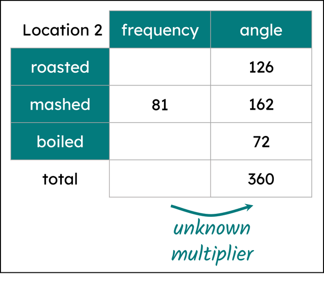
Q3.Find the number of people who preferred boiled potatoes.
Q4.Match the missing number (labelled by a letter) in the ratio table with its correct value.
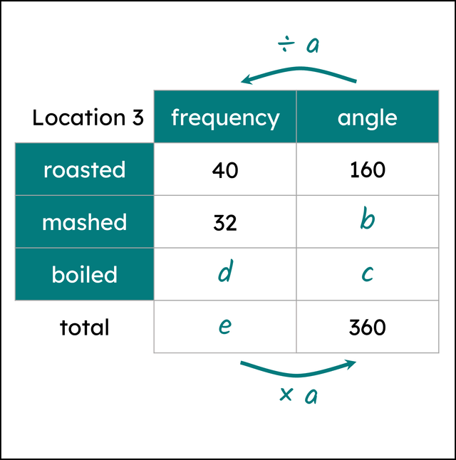
a -
4
b -
128
c -
72
d -
18
e -
90
Q5.Below are correctly drawn pie charts showing the preferred cooking methods for potatoes for people at Locations 4 and 5. Select the statements that are always true.
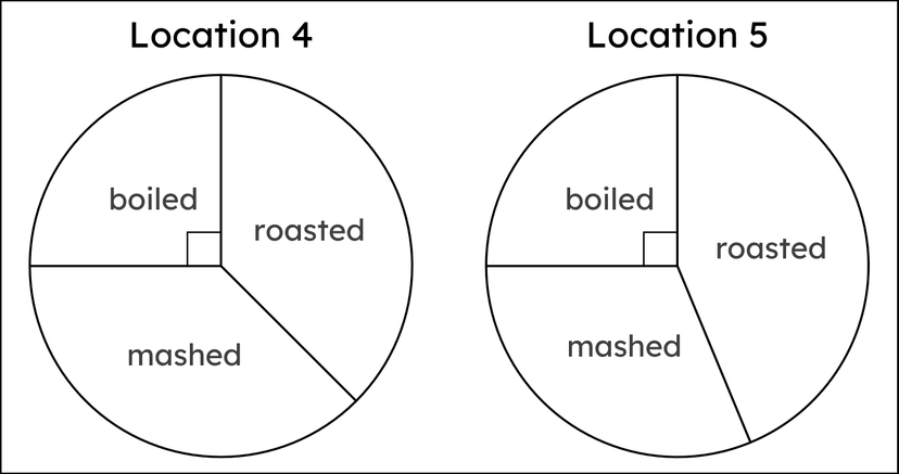
Q6.75 people voted for roasted in Location 4. By using a protractor and this information, calculate the total frequency of the people who voted in Location 4.