Myths about teaching can hold you back

- Year 8
- Year 8
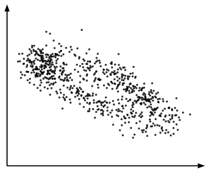
Interpreting scatter graphs
I can interpret scatter graphs using the data points shown.
Lesson details
Key learning points
- Scatter graphs can be used to find a second value when the first value is known.
- A general trend may be observed from a scatter graph.
- Extrapolation may not be valid as this is outside the data set.
Keywords
Interpolation - Interpolation is the process of estimating unknown values that are inside the range of existing data.
Extrapolation - Extrapolation is the process of estimating unknown values that are outside the range of existing data.
Common misconception
Pupils may assume that all there is always a connection between variables in scatter graphs.
Emphasise examples showing no/weak connections, but explain that the tasks use data containing stronger connections for purpose of practice.
To help you plan your year 8 maths lesson on: Interpreting scatter graphs, download all teaching resources for free and adapt to suit your pupils' needs...
To help you plan your year 8 maths lesson on: Interpreting scatter graphs, download all teaching resources for free and adapt to suit your pupils' needs.
The starter quiz will activate and check your pupils' prior knowledge, with versions available both with and without answers in PDF format.
We use learning cycles to break down learning into key concepts or ideas linked to the learning outcome. Each learning cycle features explanations with checks for understanding and practice tasks with feedback. All of this is found in our slide decks, ready for you to download and edit. The practice tasks are also available as printable worksheets and some lessons have additional materials with extra material you might need for teaching the lesson.
The assessment exit quiz will test your pupils' understanding of the key learning points.
Our video is a tool for planning, showing how other teachers might teach the lesson, offering helpful tips, modelled explanations and inspiration for your own delivery in the classroom. Plus, you can set it as homework or revision for pupils and keep their learning on track by sharing an online pupil version of this lesson.
Explore more key stage 3 maths lessons from the Graphical representations of data unit, dive into the full secondary maths curriculum, or learn more about lesson planning.

Licence
Lesson video
Loading...
Prior knowledge starter quiz
6 Questions
Q1.Which point on the graph has the coordinates (3, 8)?
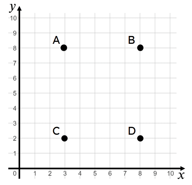
Q2.What are the coordinates of Point C in this graph?
Q3.Which is another term to describe the independent variable in bivariate data?
Q4.A graph is a visual representation for bivariate data, which can be useful when determining the nature of the relationship between the variables.
Q5.A set of bivariate data measures the length of an obstacle course and the time it takes for people to complete it. Which variable is most likely to be the dependent variable?
Q6.A set of bivariate data measures the length of an obstacle course and the time it takes for people to complete it. Which variable should go on the horizontal axis of a scatter graph?
Assessment exit quiz
6 Questions
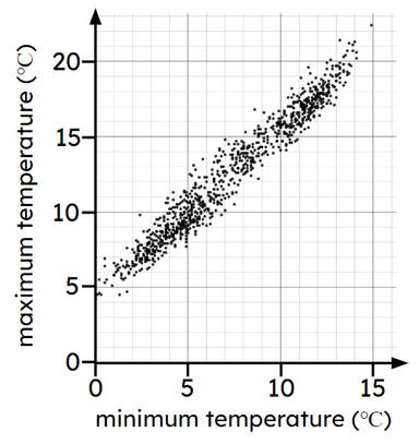
Q1.The scatter graph show minimum and maximum temperatures for different months in a town. Which statement best describes the trend in the data?
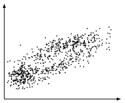
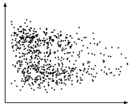
Q2.Which scatter graphs shows a case where as one variable increases the other variable tends to decrease?
Q3.Look at the scatter graph. A new month records a minimum temperature of 10 degrees Celsius. Which range could we expect the maximum temperature to be in?
Q4.Look at the scatter graph. A new month records a maximum temperature of 10 degrees Celsius. Which range could we expect the minimum temperature to be in?