Myths about teaching can hold you back

- Year 8
Analysing different statistical representations
I can use the different statistical representations to compare two sets of data.
- Year 8
Analysing different statistical representations
I can use the different statistical representations to compare two sets of data.
Lesson details
Key learning points
- Statistical summaries can be compared to graphical representations of data.
- Statistical summaries can be used to produce a sketch of what the graphical representation could be.
- Different statistical representations can help form a more complete picture.
Keywords
Statistical summary - A statistical summary sums up the features of a data set. It may contain the averages (mean, median, mode). It may also contain the range.
Central tendency - is a summary measure that attempts to describe a whole dataset with a single value that represents the middle or centre of its distribution.
Spread - The spread/dispersion of data values describes how far apart the pieces of data are.
Common misconception
The mean and median will always be close to the most frequent values (or peaks) in a dataset.
The mean and median may be at the lower or lowest frequency parts of a distribution. This is especially likely if the data is bimodal.
To help you plan your year 8 maths lesson on: Analysing different statistical representations, download all teaching resources for free and adapt to suit your pupils' needs...
To help you plan your year 8 maths lesson on: Analysing different statistical representations, download all teaching resources for free and adapt to suit your pupils' needs.
The starter quiz will activate and check your pupils' prior knowledge, with versions available both with and without answers in PDF format.
We use learning cycles to break down learning into key concepts or ideas linked to the learning outcome. Each learning cycle features explanations with checks for understanding and practice tasks with feedback. All of this is found in our slide decks, ready for you to download and edit. The practice tasks are also available as printable worksheets and some lessons have additional materials with extra material you might need for teaching the lesson.
The assessment exit quiz will test your pupils' understanding of the key learning points.
Our video is a tool for planning, showing how other teachers might teach the lesson, offering helpful tips, modelled explanations and inspiration for your own delivery in the classroom. Plus, you can set it as homework or revision for pupils and keep their learning on track by sharing an online pupil version of this lesson.
Explore more key stage 3 maths lessons from the Numerical summaries of data unit, dive into the full secondary maths curriculum, or learn more about lesson planning.

Licence
Lesson video
Loading...
Prior knowledge starter quiz
6 Questions
Q1.In which of these statistical graphs can the frequency of the data set be seen from the graph alone?
Q2.Which of these statistical graphs is best at showing the change in the value of something over time?
Q3.Which of the following statements is true when describing the mode of these four bar charts?
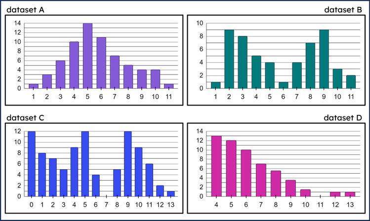
Q4.Match the statements that summarise these bar charts to the value that end each sentence.
13
9
5
4
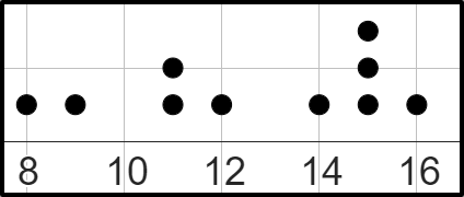
Q5.How much larger is the mode of this dot plot compared to its mean?
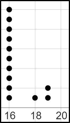
Q6.How much larger is the mean of this dot plot compared to its mode? Give your answer rounded to 1 decimal place.
Assessment exit quiz
6 Questions
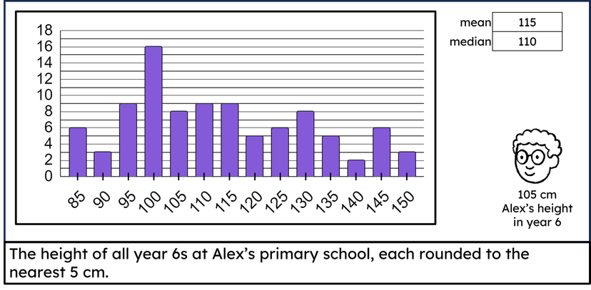
Q1.Which of these statements is valid when comparing the height of Alex in year 6 to the "average" height of other year 6s at his primary school?
Q2.Select the data sets which match the following statistical summary: a range of 14
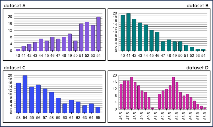
Q3.Which of these is a representative median of the data set that has following statistical summary: a mode at 54, a range of 14, a mean of approximately 50?
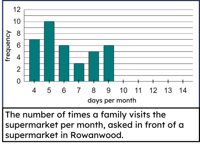
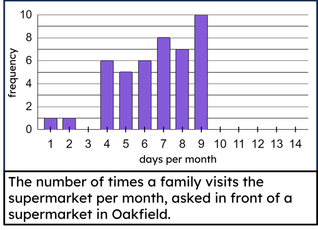
Q4.Sam asks 55 people how many times per month they visit the supermarket. Sam loses some of the data, but represents the rest on a bar chart. How many people's data did Sam lose? people
Q5.Here is an incomplete bar chart for a data set. The range of the data set is 12 days. What is the maximum number of days per month that the people surveyed visited the supermarket? days
Q6.This bar chart has missing bars. 50 people were surveyed. The range is 7. The frequency of 11 days is 3 greater than the frequency of 10 days. Work out the frequency for 10 days.