Myths about teaching can hold you back

- Year 8
Comparing statistical representations
I can see that different statistical representations offer different insights into a set of data.
- Year 8
Comparing statistical representations
I can see that different statistical representations offer different insights into a set of data.
Lesson details
Key learning points
- A pie chart and a bar chart offer different insights.
- There are certain features of any representation that make it useful.
Keywords
Pie chart - A pie chart (pie graph) is a circular graph where sectors represent different groups proportionally.
Bar chart - A bar chart (bar graph) is a graph consisting of bars visually representing the frequency of objects or groups.
Common misconception
Pie charts but not bar charts can show what proportion of a dataset a particular subgroup represents
You can figure out proportion from a bar chart by comparing the frequency of one subgroup to the total frequency, by adding heights of bars.
To help you plan your year 8 maths lesson on: Comparing statistical representations, download all teaching resources for free and adapt to suit your pupils' needs...
To help you plan your year 8 maths lesson on: Comparing statistical representations, download all teaching resources for free and adapt to suit your pupils' needs.
The starter quiz will activate and check your pupils' prior knowledge, with versions available both with and without answers in PDF format.
We use learning cycles to break down learning into key concepts or ideas linked to the learning outcome. Each learning cycle features explanations with checks for understanding and practice tasks with feedback. All of this is found in our slide decks, ready for you to download and edit. The practice tasks are also available as printable worksheets and some lessons have additional materials with extra material you might need for teaching the lesson.
The assessment exit quiz will test your pupils' understanding of the key learning points.
Our video is a tool for planning, showing how other teachers might teach the lesson, offering helpful tips, modelled explanations and inspiration for your own delivery in the classroom. Plus, you can set it as homework or revision for pupils and keep their learning on track by sharing an online pupil version of this lesson.
Explore more key stage 3 maths lessons from the Numerical summaries of data unit, dive into the full secondary maths curriculum, or learn more about lesson planning.

Equipment
Licence
Lesson video
Loading...
Prior knowledge starter quiz
6 Questions
Q1.The bar chart shows the weather over 40 days one winter. What is the modal type of weather?
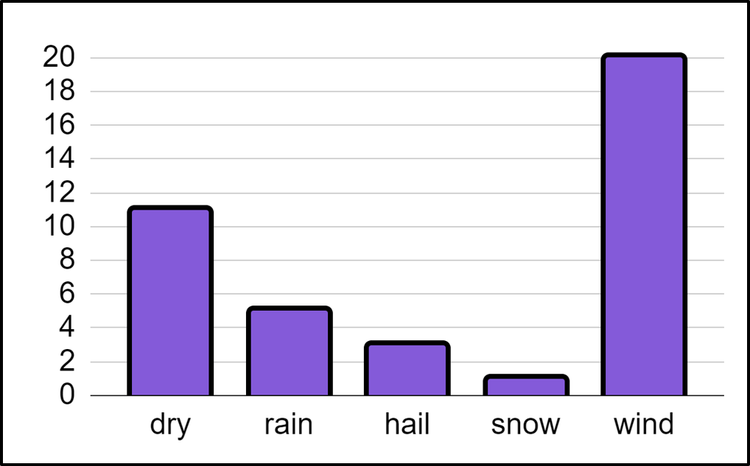
Q2.The bar chart shows the weather over 40 days one winter. How many more days were dry than had hail? days.
Q3.The bar chart shows the weather over 40 days one winter. On what fraction of days did it rain? Give your answer in its simplest form.
Q4.This pie chart shows 60 vehicles that passed the road nearby a school. What is the modal vehicle that passed nearby the school?
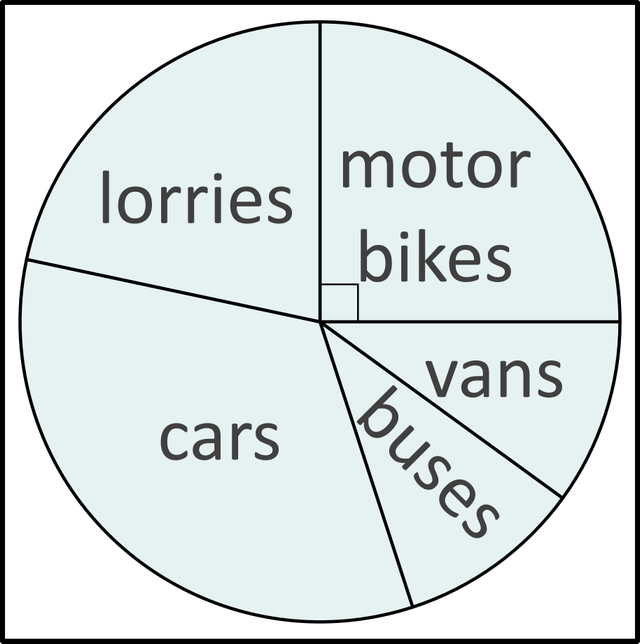
Q5.This pie chart shows 60 vehicles that passed the road nearby a school. Which two vehicles were counted an equal number of times?
Q6.This pie chart shows 60 vehicles that passed the road nearby a school. Complete the statement: motorbikes passed nearby the school.
Assessment exit quiz
6 Questions
Q1.Match each statement to the graph (bar chart, pie chart, or both) from which the statement can most easily be found.
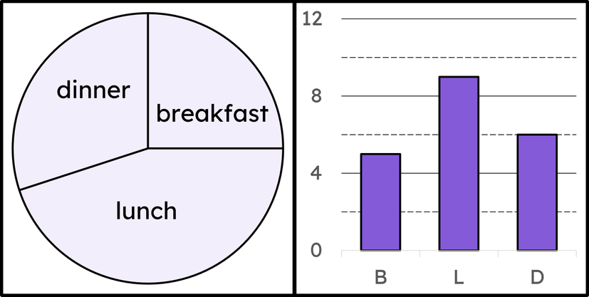
both
pie chart
bar chart
Q2.The pie chart and bar chart represent the same data set. Match the bars on the bar chart to the sectors of the pie chart.
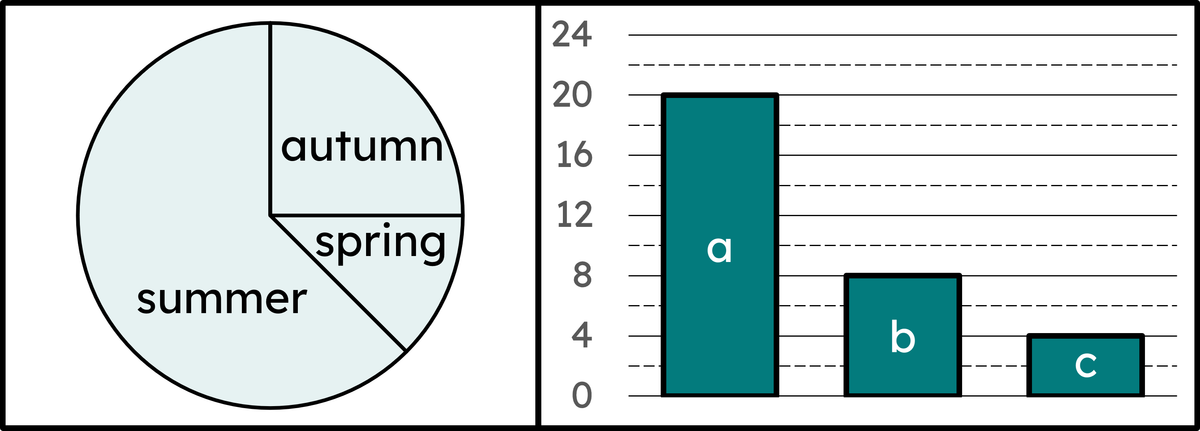
summer
autumn
spring
Q3.The angle of the sector representing autumn on the pie chart is 90°. Using the bar chart, what will the angle of the sector representing spring on the pie chart be?
Q4.The pie chart and bar chart represent the same data set. Which two school trips were equally popular?
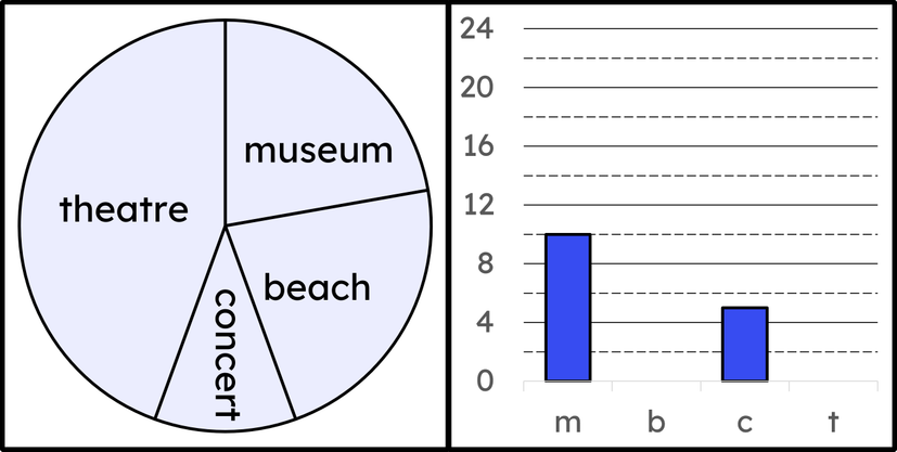
Q5.The angle of the sectors for museum and beach are both 80°. What should the height of the bar representing theatre be on the bar chart?
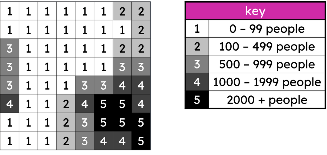
Q6.On this choropleth map, there is a new, quite densely populated settlement on the centre left of the map represented by 4 squares. The minimum population of this settlement is people.