Myths about teaching can hold you back


- Year 10•
- Foundation


- Year 10•
- Foundation
Checking understanding of pie charts
I can construct and interpret pie charts.
Lesson details
Key learning points
- Certain data is suitable for a pie chart.
- The shape of the chart can be estimated from the data.
- For larger data sets, technology can make constructing charts quicker.
Keywords
Sector - A sector is the region formed between two radii and their connecting arc.
Pie chart - A pie chart (pie graph) is a circular graph where sectors represent different groups proportionally.
Common misconception
A bigger sector on one pie chart compared to another means a larger frequency.
Pie charts show proportion, but tell nothing about frequency. The total frequency of one pie chart could be significantly larger or smaller than the other pie chart.
To help you plan your year 10 maths lesson on: Checking understanding of pie charts, download all teaching resources for free and adapt to suit your pupils' needs...
To help you plan your year 10 maths lesson on: Checking understanding of pie charts, download all teaching resources for free and adapt to suit your pupils' needs.
The starter quiz will activate and check your pupils' prior knowledge, with versions available both with and without answers in PDF format.
We use learning cycles to break down learning into key concepts or ideas linked to the learning outcome. Each learning cycle features explanations with checks for understanding and practice tasks with feedback. All of this is found in our slide decks, ready for you to download and edit. The practice tasks are also available as printable worksheets and some lessons have additional materials with extra material you might need for teaching the lesson.
The assessment exit quiz will test your pupils' understanding of the key learning points.
Our video is a tool for planning, showing how other teachers might teach the lesson, offering helpful tips, modelled explanations and inspiration for your own delivery in the classroom. Plus, you can set it as homework or revision for pupils and keep their learning on track by sharing an online pupil version of this lesson.
Explore more key stage 4 maths lessons from the Comparisons of numerical summaries of data unit, dive into the full secondary maths curriculum, or learn more about lesson planning.

Licence
Lesson video
Loading...
Prior knowledge starter quiz
6 Questions
Q1.Match the descriptions for amounts of rotation with the number of degrees each is equivalent to.
an eighth of a turn -
45°
a quarter turn -
90°
a three-eighth turn -
135°
a half turn -
180°
a three-quarter turn -
270°
a seven-eighth turn -
315°
Q2.Find $${3}\over{5}$$ of 40
Q3.If 4 tennis balls cost £3, then how much would 24 tennis balls cost? Make sure to include units in your answer.
Q4.If 5 footballs cost £35, then how much would 8 footballs cost?
Q5.If 80 table tennis balls cost £22, then how many table tennis balls would cost £3?
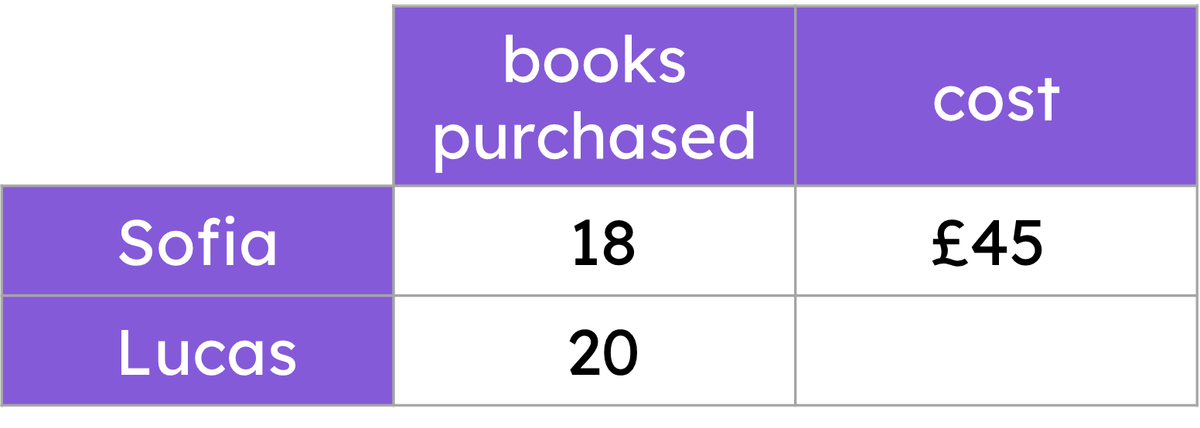
Q6.Sofia and Lucas both purchase books at a secondhand bookstore to donate to their school. Each book costs the same amount. How much more, in pounds, did Lucas spend on books?
Assessment exit quiz
6 Questions
Q1.The table shows the number of people at Location 1 and their preferred way to cook potatoes. Calculate the size of the angle for roasted potatoes.
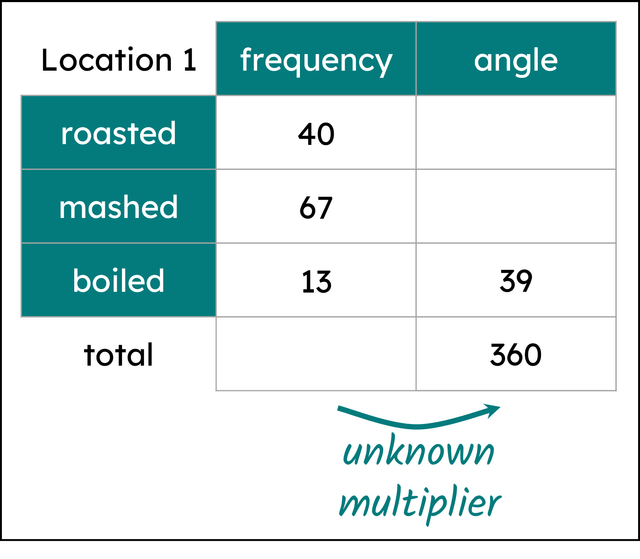
Q2.The table shows the number of people at Location 1 and their preferred way to cook potatoes. Calculate the size of the angle for mashed potatoes.

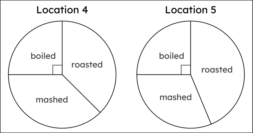
Q3.Below are correctly drawn pie charts showing the preferred cooking methods for potatoes for people at Locations 4 and 5. Select the statements that may not be true.
Q4.True or false? A protractor with a maximum angle of 180° cannot be used to draw an angle bigger than 180°.
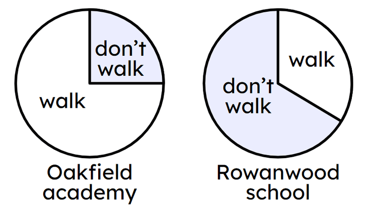
Q5.In which school did more pupils walk to school?

Q6.300 pupils walk to Rowanwood school. If one quarter of the 400 pupils who attend Oakfield don't walk to school, which school has more pupils that walk to it?
