Myths about teaching can hold you back

- Year 10
- Foundation
Problem solving with comparisons of numerical data
I can use my understanding of graphs and summary statistics to solve more complex problems.
- Year 10
- Foundation
Problem solving with comparisons of numerical data
I can use my understanding of graphs and summary statistics to solve more complex problems.
Lesson details
Key learning points
- When presented with a large volume of data, valid interpretation can be hard.
- It is important that any conclusions are supported by the data.
- In the real world, multiple representations are often used so critiquing them is a vital skill.
Keywords
Bar chart - A bar chart (bar graph) is a graph consisting of bars visually representing the frequency of objects or groups.
Pie chart - A pie chart (pie graph) is a circular graph where sectors represent different groups proportionally.
Scatter graph - A scatter graph is a visual representation for bivariate data. It can be useful when determining the nature of the relationship between the variables.
Common misconception
Claims can be made based on the data displayed in a chart.
A claim is only valid for the particular selection of data shown. This can mean that any conclusions are very limited.
To help you plan your year 10 maths lesson on: Problem solving with comparisons of numerical data, download all teaching resources for free and adapt to suit your pupils' needs...
To help you plan your year 10 maths lesson on: Problem solving with comparisons of numerical data, download all teaching resources for free and adapt to suit your pupils' needs.
The starter quiz will activate and check your pupils' prior knowledge, with versions available both with and without answers in PDF format.
We use learning cycles to break down learning into key concepts or ideas linked to the learning outcome. Each learning cycle features explanations with checks for understanding and practice tasks with feedback. All of this is found in our slide decks, ready for you to download and edit. The practice tasks are also available as printable worksheets and some lessons have additional materials with extra material you might need for teaching the lesson.
The assessment exit quiz will test your pupils' understanding of the key learning points.
Our video is a tool for planning, showing how other teachers might teach the lesson, offering helpful tips, modelled explanations and inspiration for your own delivery in the classroom. Plus, you can set it as homework or revision for pupils and keep their learning on track by sharing an online pupil version of this lesson.
Explore more key stage 4 maths lessons from the Comparisons of numerical summaries of data unit, dive into the full secondary maths curriculum, or learn more about lesson planning.

Licence
Lesson video
Loading...
Prior knowledge starter quiz
6 Questions
Q1.A __________ is a visual representation for bivariate data. It can be useful when determining the nature of the relationship between the variables.
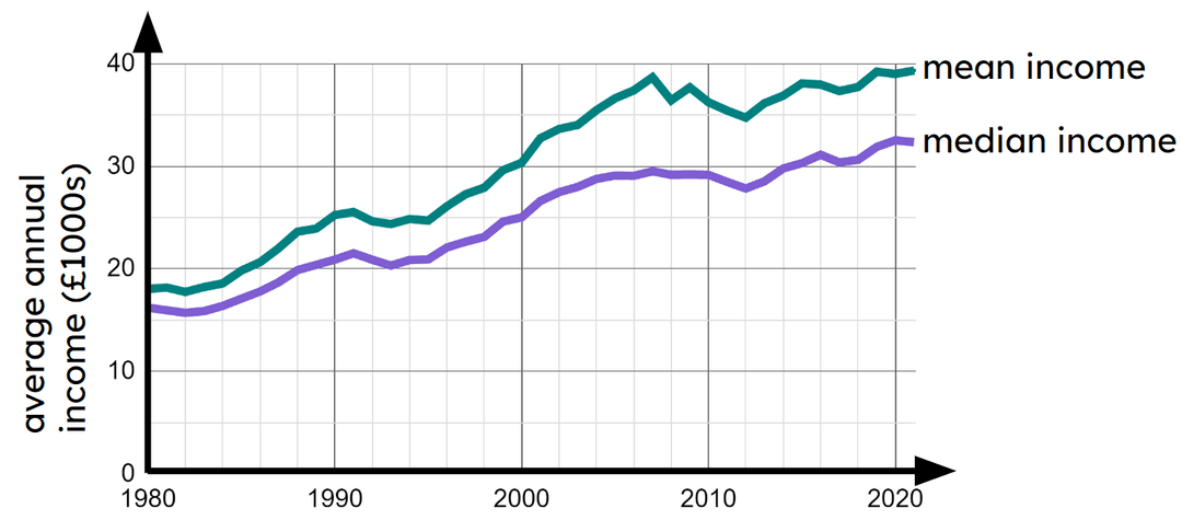
Q2.The time series below shows data from the ONS about the average annual income per person each year. Based on this graph, which statement is true?
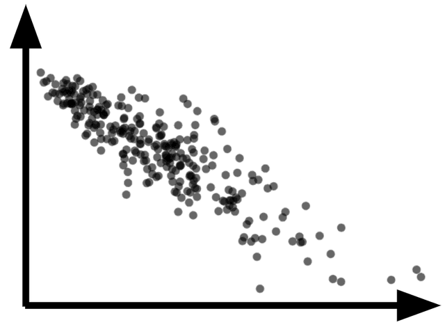
Q3.What type of correlation can be seen in the scatter graph?
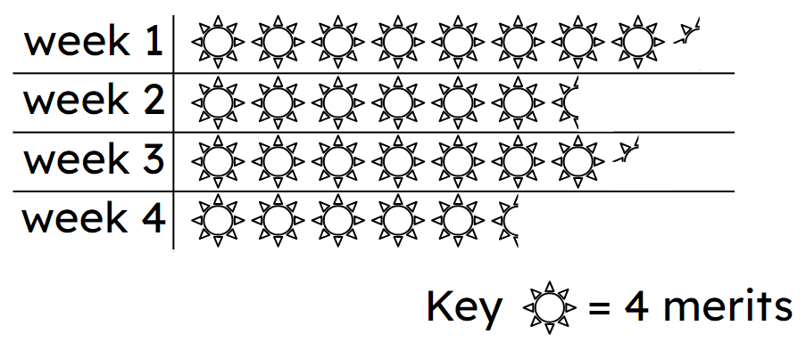
Q4.The pictogram shows how many merits Jun received each week at school. In week 3 Jun received merits.
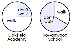
Q5.Two schools were asked how many of their pupils walk to school. The results for each school are represented in the pie charts. Which statement is true?
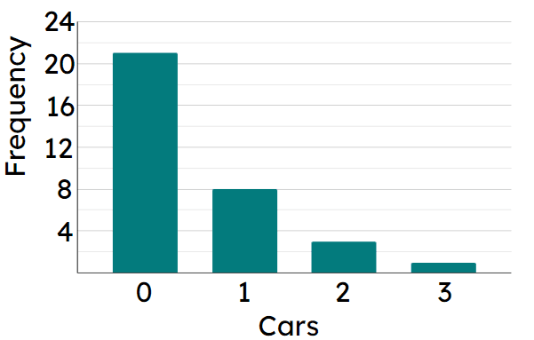
Q6.The bar chart shows the number of cars parked on driveways in a particular street. Altogether cars are parked.
Assessment exit quiz
6 Questions
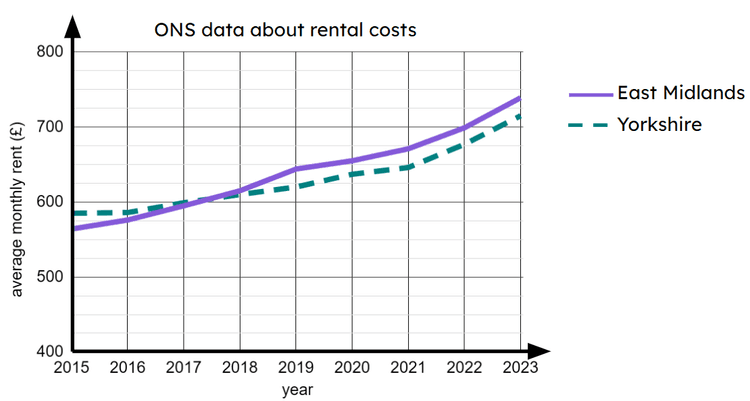
Q1.The time series graph shows data from the ONS. During which year did the average monthly rent in East Midlands become more expensive than in Yorkshire?
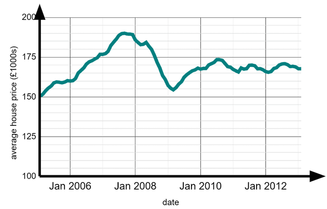
Q2.The time series graph shows data from the ONS about house prices from 2005 to 2013. During which year was the average house price at its highest, during this period?
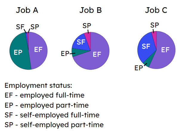
Q3.The pie charts show the employment status of workers in three different jobs. Which job has the greatest proportion of workers who are employed full-time?
Q4.The scatter graph shows data from the ONS about jobs. Which point represents someone who works a relatively low number of hours but earns a relatively high amount of money?
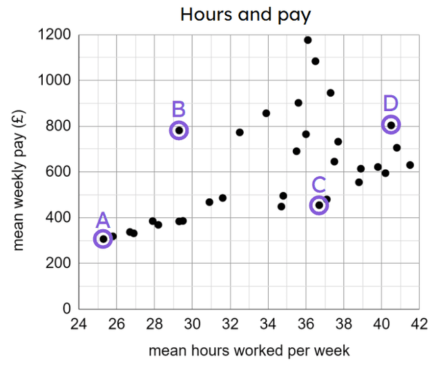
Q5.The scatter graph shows data from the ONS about jobs. Which point represents someone who works a relatively high number of hours but earns a relatively low amount of money?
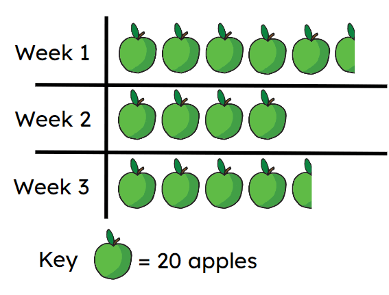
Q6.The pictogram shows the number of apples picked in an orchard over a three week period. Altogether apples were picked in the three weeks.