Myths about teaching can hold you back


- Year 10•
- Foundation


- Year 10•
- Foundation
Constructing time series graphs
I can construct time series graphs.
Lesson details
Key learning points
- Time series graphs are a visual representation
- Time series graphs plot frequency over time
- Consecutive points are joined by straight line segments
Keywords
Time series graph - Time series graphs show data over a time period. The time period is always shown on the x-axis. Data points are joined chronologically by line segments.
Common misconception
Time series graphs always use years as the time interval.
The time interval used in a time series graph depends on what the graph is intended to show.
To help you plan your year 10 maths lesson on: Constructing time series graphs, download all teaching resources for free and adapt to suit your pupils' needs...
To help you plan your year 10 maths lesson on: Constructing time series graphs, download all teaching resources for free and adapt to suit your pupils' needs.
The starter quiz will activate and check your pupils' prior knowledge, with versions available both with and without answers in PDF format.
We use learning cycles to break down learning into key concepts or ideas linked to the learning outcome. Each learning cycle features explanations with checks for understanding and practice tasks with feedback. All of this is found in our slide decks, ready for you to download and edit. The practice tasks are also available as printable worksheets and some lessons have additional materials with extra material you might need for teaching the lesson.
The assessment exit quiz will test your pupils' understanding of the key learning points.
Our video is a tool for planning, showing how other teachers might teach the lesson, offering helpful tips, modelled explanations and inspiration for your own delivery in the classroom. Plus, you can set it as homework or revision for pupils and keep their learning on track by sharing an online pupil version of this lesson.
Explore more key stage 4 maths lessons from the Graphical representations of data: scatter graphs and time series unit, dive into the full secondary maths curriculum, or learn more about lesson planning.

Licence
Lesson video
Loading...
Prior knowledge starter quiz
6 Questions
Q1.__________ is the mathematical term for a data point that is extremely large or small compared to the rest of the dataset.
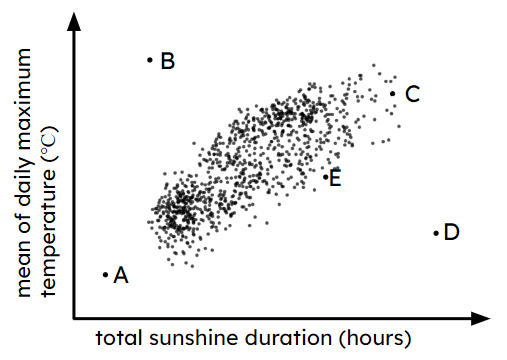
Q2.Which of these points are not outliers?
Q3.Lucas says that he has a dataset with no outliers. Could Lucas be correct?
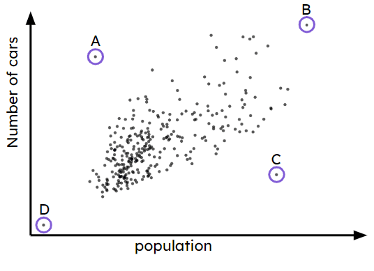
Q4.The scatter graph shows information about population and number of cars in a set of towns. Each point represents a town. Match each outlier to the correct statement.
A -
town with a low population and many cars
B -
town with a high population and many cars
C -
town with a high population and few cars
D -
town with a low population and few cars
Q5.Izzy says you should always ignore an outlier. Is Izzy correct?
Q6.Andeep says you should not show the outlier on a scatter graph. Is Andeep correct?
Assessment exit quiz
6 Questions
Q1.A graph is used to show data over a time period.
Q2.Izzy records how many birds appear in her garden over the course of a day. Here is her time-series graph. Izzy should label the horizontal axis . (Do not include units in your answer).
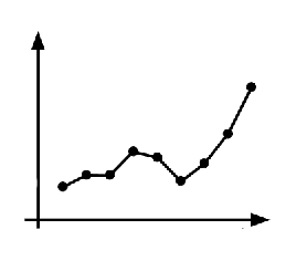
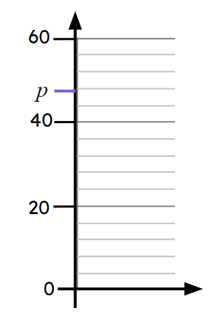
Q3.A point on this axis has been labelled $$p$$. The value of $$p$$ is .
Q4.Jun plots a time series graph using time intervals that are regular and quarterly. The first month on his graph is April, the next quarter starts with the month of .
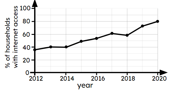
Q5.The time-series graph shows information about internet connection in Great Britain in households with 1 adult aged over 65. In 2015, approximately % of households have internet access.
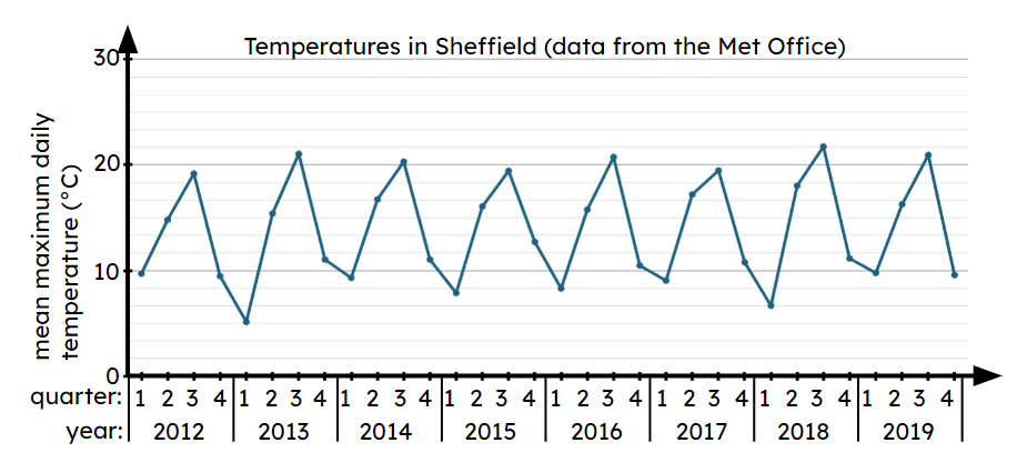
Q6.The time series graph to show the temperatures in Sheffield between 2012 and 2019. In how many quarters does the mean maximum temperature reach over 20°C ? quarters.
