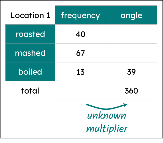
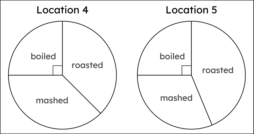
Checking understanding of pie charts
I can construct and interpret pie charts.
Checking understanding of pie charts
I can construct and interpret pie charts.
Lesson details
Key learning points
- Certain data is suitable for a pie chart.
- The shape of the chart can be estimated from the data.
- For larger data sets, technology can make constructing charts quicker.
Common misconception
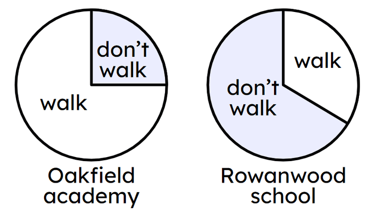
A bigger sector on one pie chart compared to another means a larger frequency.
Pie charts show proportion, but tell nothing about frequency. The total frequency of one pie chart could be significantly larger or smaller than the other pie chart.
Keywords
Sector - A sector is the region formed between two radii and their connecting arc.
Pie chart - A pie chart (pie graph) is a circular graph where sectors represent different groups proportionally.
Licence
This content is © Oak National Academy Limited (2024), licensed on Open Government Licence version 3.0 except where otherwise stated. See Oak's terms & conditions (Collection 2).
Video
Loading...
Starter quiz
6 Questions
an eighth of a turn -
45°
a quarter turn -
90°
a three-eighth turn -
135°
a half turn -
180°
a three-quarter turn -
270°
a seven-eighth turn -
315°
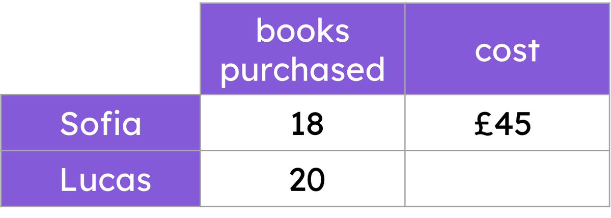
Exit quiz
6 Questions
