Myths about teaching can hold you back

- Year 10•
- Higher
Comparing various representations of data sets
I can use measures of central tendency and spread to compare two data sets in context.
- Year 10•
- Higher
Comparing various representations of data sets
I can use measures of central tendency and spread to compare two data sets in context.
Lesson details
Key learning points
- Data can be hard to compare when presented in differing formats.
- Being able to convert/interpret differing representations is useful.
- It is important to identify the most efficient form for the data to be in to compare it.
Keywords
Bar chart - A bar chart (bar graph) is a graph consisting of bars visually representing the frequency of objects or groups.
Pie chart - A pie chart (pie graph) is a circular graph where sectors represent different groups proportionally.
Stem and leaf diagram - A stem and leaf diagram is a systematic way to visually organise and represent numerical data.
Common misconception
The mode is the most useful average as it can be calculated from bar charts, pie charts and frequency tables.
Although it is often the easiest of the averages to calculate, this does not make it the most useful.
To help you plan your year 10 maths lesson on: Comparing various representations of data sets, download all teaching resources for free and adapt to suit your pupils' needs...
To help you plan your year 10 maths lesson on: Comparing various representations of data sets, download all teaching resources for free and adapt to suit your pupils' needs.
The starter quiz will activate and check your pupils' prior knowledge, with versions available both with and without answers in PDF format.
We use learning cycles to break down learning into key concepts or ideas linked to the learning outcome. Each learning cycle features explanations with checks for understanding and practice tasks with feedback. All of this is found in our slide decks, ready for you to download and edit. The practice tasks are also available as printable worksheets and some lessons have additional materials with extra material you might need for teaching the lesson.
The assessment exit quiz will test your pupils' understanding of the key learning points.
Our video is a tool for planning, showing how other teachers might teach the lesson, offering helpful tips, modelled explanations and inspiration for your own delivery in the classroom. Plus, you can set it as homework or revision for pupils and keep their learning on track by sharing an online pupil version of this lesson.
Explore more key stage 4 maths lessons from the Comparisons of numerical summaries of data unit, dive into the full secondary maths curriculum, or learn more about lesson planning.

Licence
Lesson video
Loading...
Prior knowledge starter quiz
6 Questions
Q1.A statistical summary sums up the features of a __________ .
Q2.When using spreadsheet software, which command would calculate the mean for a column of numerical data?
Q3.When using spreadsheet software, which command would calculate the range for a column of numerical data?
Q4.When using spreadsheet software, which command would calculate the median for a row of numerical data?
Q5.When using spreadsheet software, what symbol represents multiplication?
Q6.When using spreadsheet software, what is the correct way to input, and calculate, $$\frac{2\times3}{5}$$ ?
Assessment exit quiz
6 Questions
Q1.Both the pie chart and bar chart represent the same data set of: modes of transport to work. What percentage of people took the bus to work?
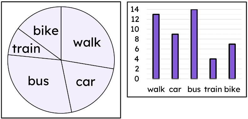
Q2.Both the pie chart and bar chart represent the same data set of: modes of transport to work. Calculate the percentage of people who travelled by car. Give your answer to 1 d.p.
Q3.True or false? A pie chart can be used to complete an incomplete stem and leaf diagram.
Q4.Calculate the median for this data set represented as a frequency table.
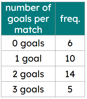
Q5.Calculate the mean for this data set represented as a frequency table. Give your answer to 1 d.p.
Q6.A newspaper reporter is writing an article about your hockey team's performance. Which average(s) would you use to help describe your average number of goals scored per match?