Myths about teaching can hold you back

- Year 10
- Higher
Problem solving with scatter graphs and time series
I can use my understanding of various scatter graphs and time series to solve problems.
- Year 10
- Higher
Problem solving with scatter graphs and time series
I can use my understanding of various scatter graphs and time series to solve problems.
Lesson details
Key learning points
- Errors in drawing the graph will produce incorrect conclusions
- Outliers may just be unusual results
- These types of graphs are widely used in the media and can be misinterpreted
Keywords
Time series graphs - Time series graphs show data over a time period. The time period is always shown on the x-axis. Data points are joined chronologically by line segments.
A scatter graph - A scatter graph is a visual representation for bivariate data. It can be useful when determining the nature of the relationship between the variables.
Common misconception
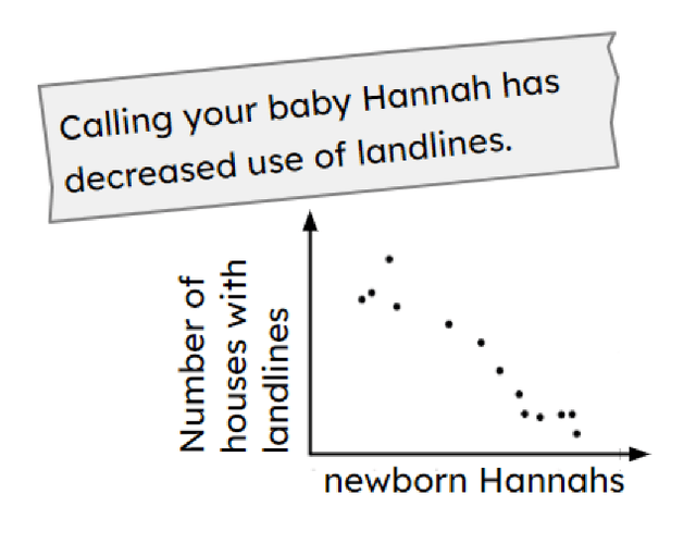
A plausible conclusion or claim must be true when it is presented with data.
Graphs can be misinterpreted, which can lead to invalid conclusions.
To help you plan your year 10 maths lesson on: Problem solving with scatter graphs and time series, download all teaching resources for free and adapt to suit your pupils' needs...
To help you plan your year 10 maths lesson on: Problem solving with scatter graphs and time series, download all teaching resources for free and adapt to suit your pupils' needs.
The starter quiz will activate and check your pupils' prior knowledge, with versions available both with and without answers in PDF format.
We use learning cycles to break down learning into key concepts or ideas linked to the learning outcome. Each learning cycle features explanations with checks for understanding and practice tasks with feedback. All of this is found in our slide decks, ready for you to download and edit. The practice tasks are also available as printable worksheets and some lessons have additional materials with extra material you might need for teaching the lesson.
The assessment exit quiz will test your pupils' understanding of the key learning points.
Our video is a tool for planning, showing how other teachers might teach the lesson, offering helpful tips, modelled explanations and inspiration for your own delivery in the classroom. Plus, you can set it as homework or revision for pupils and keep their learning on track by sharing an online pupil version of this lesson.
Explore more key stage 4 maths lessons from the Graphical representations of data: scatter graphs and time series unit, dive into the full secondary maths curriculum, or learn more about lesson planning.

Licence
Lesson video
Loading...
Prior knowledge starter quiz
6 Questions
Q1. is when you estimate values that are within the range of available data.
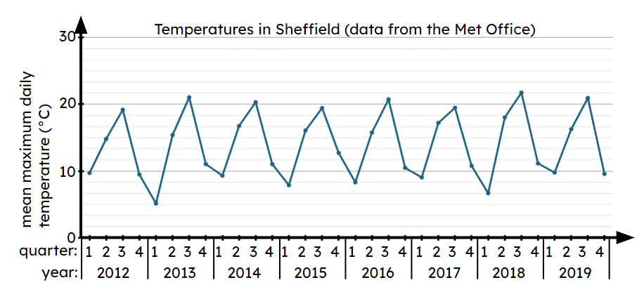
Q2.This time series graph shows the temperatures in Sheffield between 2012 and 2019. In how many quarters does the mean maximum temperature reach between 10°C and 20°C? quarters.
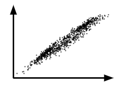
Q3.This scatter graph shows correlation.
Q4.The time series below shows data from the ONS about the average annual income per person each year. What is the approximate median income in the year 2014?
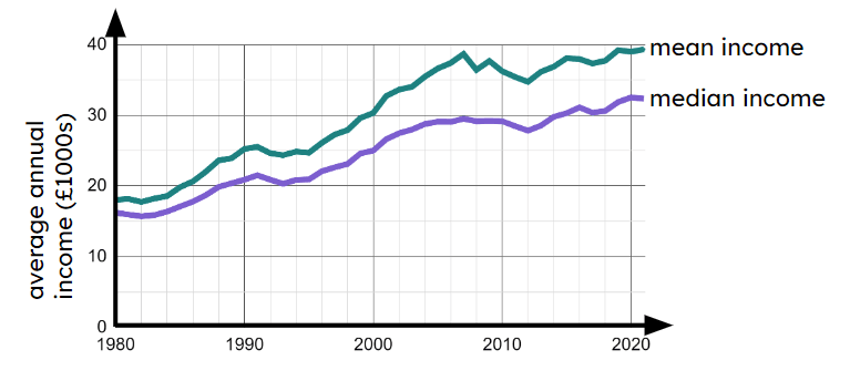
Q5.The time series below shows data from the ONS about the average annual income per person each year. What is the approximate smallest difference between the mean and median incomes?
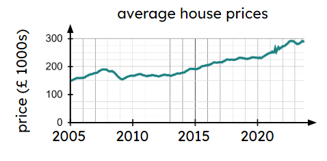
Q6.The time series graph shows data on average houses prices over a number of years in the UK. The graph shows years where average house prices were below £200 000
Assessment exit quiz
6 Questions
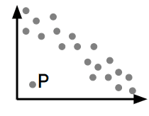
Q1.Lucas plots this scatter graph. He says, “Point P must be an error.” Is Lucas definitely correct?
Q2.This scatter graph shows positive correlation. Which of these Oak pupils are correct?
Q3. is when you estimate values that are outside the range of available data.
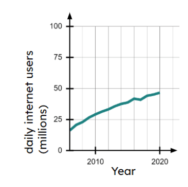
Q4.The time series graph shows data about the number of daily internet users in England. Sam says, “I can use the graph to predict there will be 90 million internet users in Wales in 2050.” Is Sam right?
Q5.A scatter graph is a visual representation for data.
Q6.A reporter writes the following headline for the Oak Daily News. Which of these Oak pupils are correct?